Healthcare UX · Academic case study

Lumen Chart EHR

Reducing cognitive load so clinicians can focus on patients, not paperwork.

My Role  Solo UX designer & researcher Timeline  June–July 2026 Scope  Research → IA → hi-fi → prototype Surfaces  Physician, nurse, caregiver

Scope honesty: solo academic project. No clinician or patient access — personas are fictional composites grounded in published literature. No real patient data.
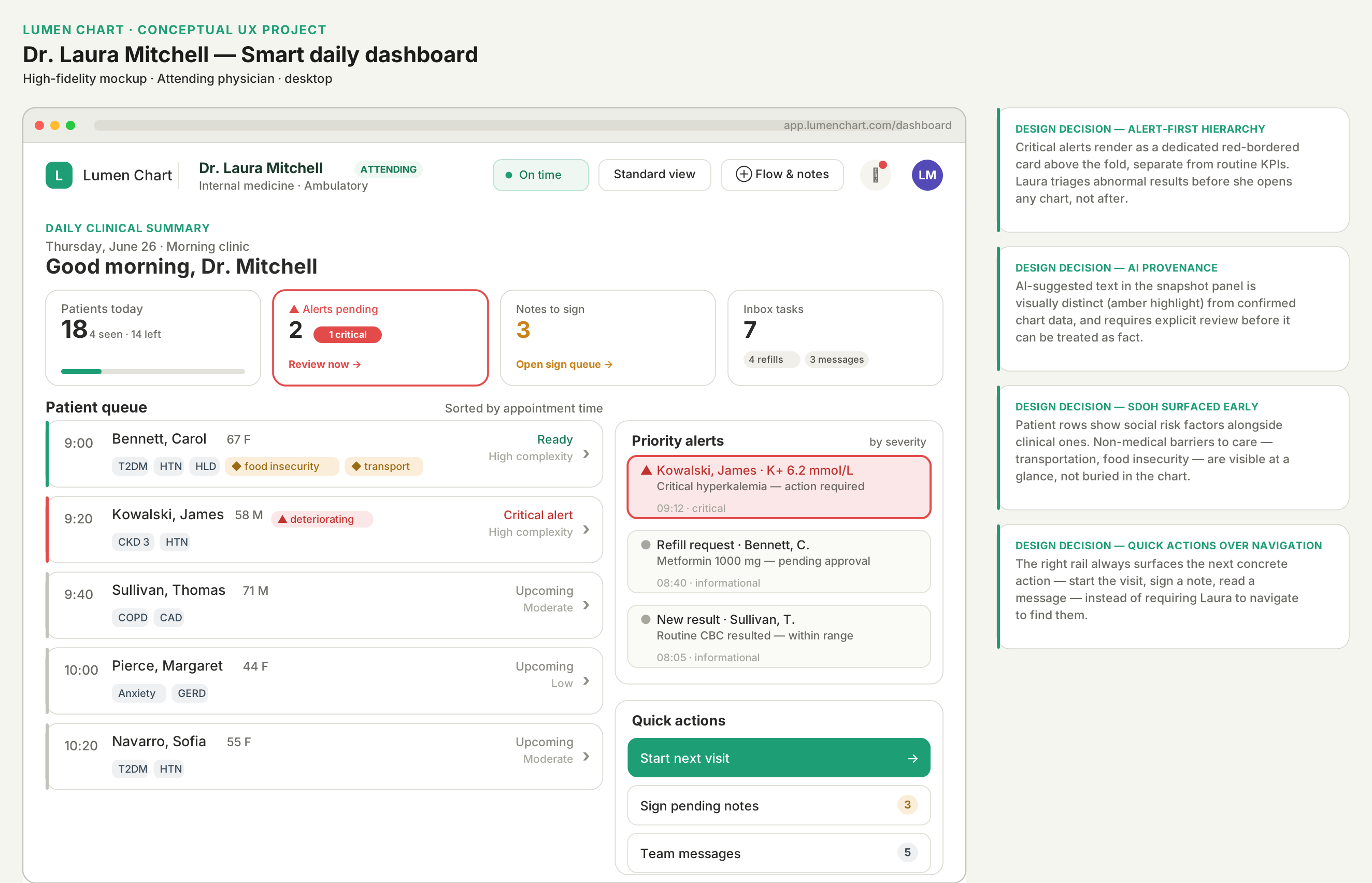
Lumen Chart clinician dashboard with patient overview, schedule, and AI documentation tools
Healthcare nurse using an electronic medical record system at a workstation
The problem

Clinicians spend more time in the chart than with patients.

AI scribes promise the time back, but introduce hallucination risk and opaque sourcing — so clinicians won't sign what they can't verify, and caregivers get jargon instead of answers.

2:1
Hours in the EHR for every hour of direct patient care
Sinsky et al., 2016
31%
Of ambient AI notes contained hallucinations in one evaluation (vs 20% of human notes)
Palm et al., 2025
13.4 min
Daily EHR time saved with AI scribes — but the gain erodes when verification is poor
Rotenstein et al., 2026
18%
Persona AI-trust score for the primary clinician. One-click sign is a disqualifier
Synthesized from V1–V4
The real design problem is not speed — it's accountability. Time saved in drafting is spent again in unstructured cleanup unless review is designed as deliberately as capture.
Final how might we

How might we redesign EHR review and documentation so clinicians can chart with less cognitive load, reclaim time for patients, and produce trustworthy plain-language updates that keep family caregivers informed — while reducing burnout risk?

Centers efficiency and the human outcome — time back with patients.
Names the trust problem AI created, not just the speed problem.
Keeps caregivers in scope without going too broad.
Actionable for interface design inside real primary-care constraints.
The process

Six phases, adapted for clinical constraints.

Evidence first, then reframing, design, evaluation, and iteration as separate stages — because in a high-liability setting you have to be able to defend a decision from a citation, not from taste.

I directed the research synthesis and selected the evaluation methods and frameworks. AI tools helped structure literature coding, surface candidate sources for my review, and draft initial versions of personas and flows, which I then refined against the source literature and clinical constraints.

01
Rethink
Evidence synthesis, literature-grounded personas
02
Redefine
“How might we” questions, user flows, information architecture
03
Redesign
Wireframes, then high-fidelity mockups
04
Revision
Heuristic evaluation + moderated usability session
05
Refine
Prioritized iteration, high to polish
06
Launch
Final interactive prototype
01 Rethink

A UX research synthesis wall, coded so every design choice traces to a source.

Nine themes coded A–V across 2016–2026 literature on documentation burden, ambient AI accuracy, clinician trust, and caregiver needs. Click any theme to read the findings and citations.

How to read the codes: every finding carries a letter + number (B1, H4, V2). Later in the case study, design decisions cite those codes — so you can trace amber diff highlighting back to D1–D3 and the sign-off gate back to V1–V4.
01 Rethink · continued

Three users, three incompatible contexts, one record.

These personas translate the research synthesis into concrete design targets. Each was developed as a fictional composite grounded in published literature on healthcare roles and workflows, with AI assistance used to help structure and refine the profiles. Click any persona to view the full background, goals, pain points, behaviors, and research-backed quotes.

Personas are fictional composites created for educational purposes. Any resemblance to real individuals is coincidental.

From the three literature-grounded personas

Five cross-cutting themes

These themes were coded across the three personas—shared breakdowns like documentation burden and interrupted workflows, alongside role-specific needs like AI signing trust, alert hierarchy, and caregiver reassurance. Not every pattern applies to every persona; each card notes where it surfaced. Click any theme for research-backed quotes and evidence codes.

02 Redefine

Two trust gates, and nothing more than two clicks from home.

Laura's chronic-care visit was mapped end to end so the AI review gates sit at the two moments liability actually lands: per-section Accept, and pre-sign confirmation. The information architecture (IA) keeps documentation and handoff at the top level instead of burying the two biggest burnout drivers.

Why shallow: depth is where “death by a thousand clicks” lives. Documentation and Team & Handoff were elevated to first-class sections, following NIST-aligned EHR usability principles.
03 Redesign

Structure locked in wireframes, trust made visible in hi-fi.

Six low-fidelity screens fixed hierarchy, density, and alert treatment across all three roles before any visual polish. Click any screen to view it full size.

Low-fidelity Wireframes · 6 screens · 3 roles Structure, hierarchy, and density
High-fidelity Laura's full day, end to end Dashboard triage → AI snapshot → SOAP editor → two-gate pre-sign

Amber marks every AI-generated line until it's accepted. On visit prep, each AI-suggested agenda item includes a Why? control that reveals the guideline source and clinical rationale on demand.

Key decision — desktop-first for high-cognitive work. AI review, Accept gates, and signing happen at the workstation where documentation density and liability risk peak. Tablet stays a secondary path for lighter in-room tasks.
04 Revision

No catastrophes — but four majors worth fixing.

A full heuristic review against Nielsen's 10, Google PAIR / Microsoft HAX AI guidance, and WCAG 2.2 AA, plus one moderated think-aloud session. Each method surfaced distinct issues — expert review flagged reversibility and recovery gaps; the session exposed first-use semantics and discoverability gaps.

4 · Catastrophe0
3 · Major4
2 · Minor7
1 · Cosmetic3
0 · Positive1414

Zero catastrophic issues — and 14 positive findings.

The evaluation validated the trust mechanics: amber provenance, per-section Accept, and two-gate signing all mapped to UX Research Synthesis Wall recommendations D1–D5. Four majors were about reversibility — what happens when a clinician changes their mind, or the system fails mid-write.

Usability session · what worked

7/7 on all five post-test metrics — from a participant with zero EHR experience

A surgical first assistant completed the full dashboard → snapshot → SOAP → gated sign path cold, rating ease, AI-vs-verified confidence, amber helpfulness, transcript usefulness, and two-gate appropriateness at ceiling. She said she'd trust signing in this system, citing the visible confirm cues.

Usability session · the real finding

Amber drew attention — but it read as “needs attention,” not “AI-generated”

Visual salience worked; semantics didn't. The pencil edit affordance and “Always verify” banner were also easy to miss. Strong scores coexisted with a first-use gap, which became the highest-leverage fix.

Scope note: timeboxed access meant one moderated session, not a study. It's reported as a single data point that complemented the heuristic review by surfacing learnability and meaning-making gaps expert review alone wouldn't catch — not as statistical evidence.
05 Refine

Fixes prioritized high to polish.

Heuristic review and the usability session produced complementary findings, not duplicate ones. Expert review flagged reversibility gaps — no Unaccept and a pre-sign gate without locked sign, individual acknowledgments, or specific error guidance — plus chart-write failure recovery and a mid-flow discard gap that were not included in the live prototype. The moderated session surfaced learnability gaps: amber read as generic urgency, edit affordances were overlooked, and first-time users needed explicit onboarding. The refinements below reflect what shipped in the live prototype.

High priority

Skippable onboarding wizard

Usability test · learnability
Before

Amber read as a generic “needs attention” flag. Pencil edit and “Always verify” were overlooked. Participant asked to have “used it before.”

After

First-load wizard with progressive highlights: amber = AI draft, pencil = edit, per-section Accept + two-gate signing. Dismissible for returning users.

High priority

Unaccept / re-review control

Heuristic H3 · user control
Before

An accepted SOAP section was locked — no path to reverse the decision and re-review AI content before signing.

After

Any accepted section can be reverted for re-review, restoring clinician agency where skepticism is highest.

High priority

Strengthened pre-sign gate

Heuristic · error prevention
Before

Sign could be reached before both acknowledgments were complete, and a failed sign attempt gave no specific guidance on what was missing.

After

Sign stays locked until both acknowledgments are checked individually, with no bulk shortcut. A failed attempt shows which acknowledgment is missing, highlights unchecked boxes, and moves focus there.

Medium priority

Persistent visit context

Workflow continuity
Before

Checked agenda items and open SDOH actions disappeared once the clinician moved into SOAP editing.

After

Sticky visit summary carries agenda and open SDOH actions across SOAP and pre-sign.

Polish

Accessibility & efficiency

Heuristic · WCAG 2.2 AA
Before

Incomplete keyboard paths, thin live announcements, unclear remaining-section feedback on the disabled Sign button.

After

Keyboard shortcuts, improved aria-live announcements, and clearer remaining-section feedback on the disabled Sign button.

06 Launch

The final interactive prototype

One polished experience built on contextual progressive disclosure — show what’s relevant now, reveal the rest on demand. Desktop-first, because that’s where Laura’s heaviest cognitive work happens.

Open live prototype
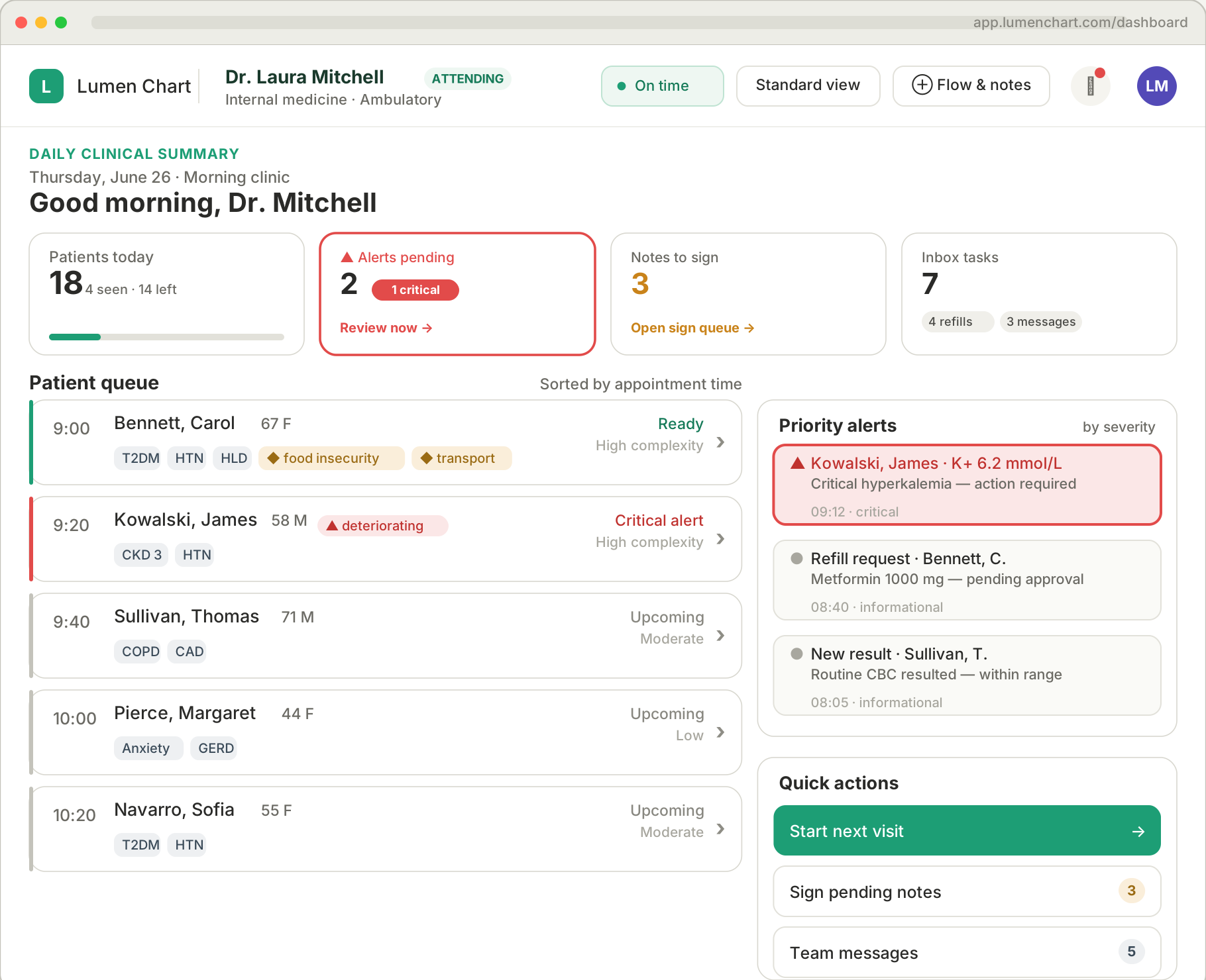
Lumen Chart clinician dashboard with patient queue, priority alerts, and quick actions

Implemented in the prototype above

Key decisions

Six choices that make AI assistance in clinical settings accountable.

Each one traces back to a coded finding on the UX research synthesis wall.

Amber AI diff highlighting

All AI-generated text sits on #FAEEDA until accepted, then clears. Addresses the top clinician complaint: not knowing what the machine wrote. D1–D3

Per-section Accept + two-gate signing

Sign stays disabled until every section is accepted and both acknowledgments are checked. Deliberate friction where liability lands. V1–V4

Transcript toggle

“Show me what it heard” — speaker-labeled, timestamped lines as ground truth. Rated 7/7 for helpfulness in testing. H1–H4

Queue-level alerts & SDOH

Critical flags and SDOH tags surface on queue rows before a chart opens — high-risk context stays visible before AI summaries compress it. Accountability starts at triage, not after sign-off. A1–A2 · N1–N2

Agenda “Why?” provenance

Each line on the AI-suggested visit agenda includes a Why? control that surfaces the guideline source and rationale — overdue screenings and SDOH flags stay scannable without hiding where the recommendation came from. D3 · V1

Simplified view toggle

One click reduces interface density so amber diff, Accept gates, and blocking states stay legible under interruption — less clutter means fewer skipped verifications. D5

Reflection

Key takeaways for the next clinical project

01

Visual salience is not meaning

Amber drew the eye but not the concept. Without an explicit map, users invent the wrong story — signifiers matter as much as color.

02

Novices catch foundational gaps

An EHR novice exposed discoverability issues an expert would have skipped past. The 7/7 scores validated the flow; missing first-use support was the actual finding.

03

High-stakes AI needs intentional friction

Per-section Accept and two-gate signing slow the commitment step on purpose. That's a safety feature, not a usability bug.

04

Complementary evaluation sharpens decisions

Heuristic review and one moderated session produced distinct findings that informed the same iteration plan. Expert review stressed reversibility and recovery — Unaccept, stronger signing gates with specific error guidance. Chart-write failure recovery was flagged but not built in the demo. The session stressed learnability — onboarding for amber, pencil, and Accept meaning. Different signals; one coherent refinement plan. Small sample, clear signal.

Ambient AI only earns adoption when clinicians can see what the machine heard, what it drafted, and what they have personally verified — and reverse any section they are not ready to stand behind. That is why provenance cues, per-section Accept with Unaccept, transcript ground truth, and two-gate signing are features, not friction. Lumen Chart is less about automating notes and more about making AI-assisted documentation accountable, reversible, and learnable under pressure.

References

Sources referenced in this case study.

View bibliography 16 sources · APA 7th edition
  1. Agency for Healthcare Research and Quality. (n.d.). Alert fatigue. Patient Safety Network. https://psnet.ahrq.gov/primer/alert-fatigue
  2. Arndt, B. G., Beasley, J. W., Watkinson, M. D., Temte, J. L., Tuan, W.-J., Sinsky, C. A., & Gilchrist, V. J. (2017). Tethered to the EHR: Primary care physician workload assessment using EHR event log data and time-motion observations. Annals of Family Medicine, 15(5), 419–426. https://doi.org/10.1370/afm.2121
  3. Gerke, S., Simon, D. A., & Roman, B. R. (2025). Liability risks of ambient clinical workflows with artificial intelligence for clinicians, hospitals, and manufacturers. JCO Oncology Practice. https://doi.org/10.1200/OP-24-01060
  4. Moy, A. J., Schwartz, J. M., Chen, R., Sadri, S., Kenyon, E., Dorr, D. A., & Rossetti, S. C. (2021). Measurement of clinical documentation burden among physicians and nurses using electronic health records: A scoping review. Journal of the American Medical Informatics Association, 28(5), 998–1008. https://doi.org/10.1093/jamia/ocaa325
  5. O’Neil, E., Rodman, A., & Lehmann, L. S. (2026). Balancing innovation and ethics: Ambient listening artificial intelligence in health care. Mayo Clinic Proceedings: Digital Health, 4(1), Article 100341. https://doi.org/10.1016/j.mcpdig.2026.100341
  6. Ohde, J. W., Thompson, A., Liu, Z., et al. (2026). Barriers and opportunities of scaling ambient AI scribes for clinical documentation across diverse healthcare settings. npj Digital Medicine. https://doi.org/10.1038/s41746-026-02554-0
  7. Olson, K. D., Meeker, D., Troup, M., et al. (2025). Use of ambient AI scribes to reduce administrative burden and professional burnout. JAMA Network Open, 8(10), Article e2534976. https://doi.org/10.1001/jamanetworkopen.2025.34976
  8. Overhage, J. M., & McCallie, D., Jr. (2020). Physician time spent using the electronic health record during outpatient encounters: A descriptive study. Annals of Internal Medicine, 172(3), 169–174. https://doi.org/10.7326/M18-3684
  9. Palm, E., Manikantan, A., Mahal, H., Subramanya Belwadi, S., & Pepin, M. E. (2025). Assessing the quality of AI-generated clinical notes: Validated evaluation of a large language model ambient scribe. Frontiers in Artificial Intelligence. https://doi.org/10.3389/frai.2025.1691499
  10. Rotenstein, L. S., et al. (2026). Changes in clinician time expenditure and visit quantity with adoption of artificial intelligence–powered scribes: A multisite study. JAMA, 335(16), 1408–1417. https://doi.org/10.1001/jama.2026.2253
  11. Schoening, M. B., & Cotliar, D. (2026). Patients and caregivers leveraging AI to improve their health care journey: Case study and lessons learned. Journal of Participatory Medicine, 18, Article e69790. https://doi.org/10.2196/69790
  12. Shah, S. J., Crowell, T., Jeong, Y., et al. (2025). Physician perspectives on ambient AI scribes. JAMA Network Open, 8(3), Article e251904. https://doi.org/10.1001/jamanetworkopen.2025.1904
  13. Sinsky, C., Colligan, L., Li, L., Prgomet, M., Reynolds, S., Goeders, L., Westbrook, J., Tutty, M., & Blike, G. (2016). Allocation of physician time in ambulatory practice: A time and motion study in 4 specialties. Annals of Internal Medicine, 165(11), 753–760. https://doi.org/10.7326/M16-0961
  14. Taylor, S. L., Jost, M., MacDonald, S., Ren, Y., Hilton, S., Davenport, S., Aizenberg, D., Hall, B., Lyles, C. R., & Adams, J. Y. (2026). Quality of clinical notes created by ambient listening generative AI: Pragmatic prospective pilot study. JMIR Medical Informatics, 14, Article e86474. https://doi.org/10.2196/86474
  15. Topaz, M., Peltonen, L. M., & Zhang, Z. (2025). Beyond human ears: Navigating the uncharted risks of AI scribes in clinical practice. npj Digital Medicine, 8, Article 569. https://doi.org/10.1038/s41746-025-01895-6
  16. University of Washington Medicine. (2026, April). AI scribe tools produce lower quality medical notes compared to human clinicians. https://mednews.uw.edu/news/AI-scribes-lower-quality
About this project

About This Project

This case study was developed as part of the Foster Healthcare UX program in 2026. It focuses on redesigning clinician documentation workflows in an electronic health record (EHR) system, with particular attention to AI-assisted note generation, transparency, and clinician trust. This is a hypothetical academic project created for portfolio and learning purposes. It does not represent work performed for any employer, health system, or commercial product.

Personas and Names

All personas, patient names, and scenarios in this case study are fictional and created for illustrative purposes only. They do not represent any real individuals, patients, or healthcare professionals. Any resemblance to actual persons, living or dead, is purely coincidental.

Findings

Sources

In Lumen Chart: unified pre-visit snapshot and ambient SOAP drafts cut hunting across tabs, compressing 3–5 minute chart review toward under 60 seconds.

Findings

Sources

In Lumen Chart: review is structured so the minutes reclaimed in drafting aren't spent again on unstructured cleanup.

Findings

Sources

In Lumen Chart: AI text is visually distinct from chart text; per-section Accept gates and two-gate signing make review mandatory before the note is finalized.

Findings

Sources

In Lumen Chart: provenance timestamps, transcript ground truth, per-section Accept, and a pre-sign confirmation gate that requires deliberate acknowledgment before signing.

Findings

Sources

In Lumen Chart: structured section-by-section review instead of open-ended cleanup of a wall of generated text.

Findings

Source

In Lumen Chart: rose-tier critical signals surface on the patient queue and dashboard; routine items are demoted so attention means something.

Findings

Source

In Lumen Chart: tablet queue with 3-tap vitals entry, 44px touch targets (WCAG 2.5.5), and portrait-mode layouts.

Findings

Source

In Lumen Chart: the caregiver portal answers three questions on load — is she okay, what changed, what do I need to do.

Findings

Sources

In Lumen Chart: this theme is the bridge from literature to prototype — every Key Decision and trust mechanic traces back here.

Theme 01 · All three roles

Documentation time is the primary system failure

All three roles describe documentation consuming time that should belong to patients, recovery, or care coordination.

Where it showed up

  • Laura documents at night — uncompensated cognitive labor, 6–7 hrs/day in the EHR on heavy clinic days.
  • Kevin batch-charts at shift end, reconstructing six patients from memory.
  • Diane loses hours to pharmacy and office phone calls that a status field could answer in seconds.
Evidence codes B1 · B2

Theme 02 · Physician

Trust in AI requires transparency, not just accuracy

Laura will use ambient AI, but she needs to see what the model generated versus what came from the chart. Accuracy alone is insufficient — the system has to make its own uncertainty visible.

Research-backed quote

“It got most things right but it hallucinated a medication that was never discussed. I had to read every word… I need to know exactly what it made up versus what it heard. Show me the difference.”
Resolved by

SOAP editor with amber AI diff highlights, transcript panel, per-section Accept, and pre-sign confirmation.

Evidence codes H1–H4 · V1–V4 · D1–D3

Theme 03 · Physician & nurse

Alert fatigue is a hierarchy problem, not a volume problem

Laura dismisses alerts reflexively because they all look the same. Kevin misses flags because they require chart navigation to find.

Research-backed quote

“When everything is urgent, nothing is urgent. I once dismissed a drug interaction because I was clicking through thirty alerts in a row.”
Resolved by

Tiered severity alert panel; critical flags surfaced at queue row level, not buried in the chart.

Evidence codes A1 · A2

Theme 04 · All three roles

The tool must meet users where they are

Kevin is at the bedside. Diane is on her phone between meetings. Laura is in a hallway with thirty seconds before she knocks. Every screen must function under interruption, on a touch device, inside 60 seconds of available attention.

Design requirements

  • All components meet 44px touch targets (WCAG 2.5.5).
  • Vitals and alert views function on a tablet in portrait mode.
  • Caregiver views are mobile-first, brief, and interruptible.
Evidence codes N1 · N2 · WCAG 2.5.5

Theme 05 · Caregiver

For caregivers, ambiguity is an emotional harm

Diane’s anxiety is a predictable response to a system that withholds clarity. An empty or confusing interface is not neutral — it is actively distressing.

Research-backed quote

“If the system just told me ‘she’s okay, here’s what happened, here’s what to watch for’ — that would change everything. I don’t need every clinical detail. I need to know she’s okay.”

Design implication

Every empty state, status message, and error in the caregiver view is written reassurance-first. Clinical detail like drug interaction data is deliberately withheld from caregiver views.

Evidence codes C1 · C2

Internal medicine · Chicago, IL · 15 years experience · 18–22 patients/day · Epic EHR

“I've had AI put words in my chart that I didn't mean. If I can't tell which line came from the machine and which came from the record, I won't sign it.”

Background

Laura spends 6–7 hours daily in the EHR and reviews charts the night before — unpaid cognitive labor. She has experienced AI hallucination where a system attributed symptoms a patient never mentioned, which destroyed her trust in automated signing. Alert fatigue has already caused a documented near-miss.

Goals

  • Complete all documentation before leaving the building
  • Access a single-screen pre-visit summary in under 60 seconds
  • Distinguish AI-generated text from verified chart content at a glance
  • Differentiate critical alerts from informational ones visually
  • Recover roughly an hour of personal time per night

Pain points

6–7 hrs/day in EHRNo unified pre-visit viewHallucination destroyed trustAlert fatigue near-missOne-click sign feels dangerousAfter-hours charting

On AI documentation and trust

“I've tried one. It was impressive and terrifying at the same time… The promise is real — I'd get back probably an hour a night — but I need to know exactly what it made up versus what it heard.”

On pre-visit prep

“I'll pull up the chart right before I knock on the door — sometimes in the hallway — and I'm trying to scan six months of notes in thirty seconds. Instead I'm hunting through tabs.”
Design implication: Laura abandons any tool where AI-authored content is indistinguishable from human-entered data. Every AI line needs a visible source indicator; explicit per-section Accept must precede an active Sign button. One-click sign is a disqualifier, not a feature.

Persona synthesized from published literature.

Medical-surgical unit · Detroit, MI · 9 years experience · 28-bed floor · 3 × 12hr shifts/week

“I'm responsible for six patients at once and I can't always get to a computer. The system has to keep up with me, not the other way around.”

Background

BSN from Wayne State, pursuing an MSN in nursing informatics. He oversees 4–6 nurses per shift and owns assignments, escalations, and handoffs. He batch-documents vitals hours after collection and uses paper — his hand, a paper towel — as a parallel system, because the digital tool has failed to fit his workflow. He has watched three rollouts regress to paper.

Goals

  • Complete handoff notes fast and accurately
  • Surface deteriorating patients at the queue level before opening a chart
  • Document at the bedside — reduce floor-to-chart travel to zero
  • Keep vitals current instead of reconstructing them from memory

Pain points

Charting from memoryVitals across 4 screensNo bedside accessLow-priority alert noiseStale handoff notes

On documentation timing

“Batch charting. I take vitals at 9, document them at 2. I write on my hand sometimes, or a paper towel… That's not safe. I know it's not safe. But I can't leave a patient to go sit at a workstation every time I take a blood pressure.”

On deterioration

“The patient just looked different. But to verify my gut I had to open four different screens… By the time I had everything in front of me, ten minutes had passed. The data was all there — it just wasn't together.”
Design implication: time savings must be visible within the first shift, not after a learning curve. If logging a vital requires leaving the patient or opening more than three screens, the tool is abandoned by shift two.

Persona synthesized from published literature.

Daughter of patient Maria Santos · Full-time HR manager · Suburban Detroit · Portal access granted April 2026

“I love my mom and I want to help, but I'm not a nurse. I just need to know: is she okay, what does she need to do, and what do I need to do?”

Background

Diane coordinates care for her mother (T2DM, hypertension, hyperlipidemia) alongside a full-time career and two kids. She maintains a manual medication list on her phone that diverges from the clinical record every time a dose changes. She has called the pharmacy twice about a Metformin prior auth with no resolution. Interface ambiguity creates active emotional distress, not neutral frustration.

Her three questions after every visit

  • What did the doctor say?
  • What changed?
  • What does mom need to do?

Pain points

Jargon she can't decodeUnclear access boundariesNo summary for missed visitsRefill gapsPrior auth phone loop

On the patient portal

“There's a ‘visit summary' somewhere but it's full of billing codes and abbreviations. It might as well be in another language.”

On access boundaries

“I've been nervous to click certain things because I don't know if it'll send a message to the doctor that mom didn't approve… I also don't want my mom to feel like I'm taking over her care. That's a real tension.”
Design caution: Diane has partial information, no clinical training, and deep personal stakes. Every screen should answer: is mom okay, and is there anything I need to do right now? She also underuses the portal because she can't tell which actions are hers versus Maria's — and worries that clicking the wrong thing might overstep or act without approval. Show a persistent can/can't permissions list and when access was granted (e.g. "Access granted by Maria Santos, Apr 2, 2026") so she knows the boundary is documented before she acts.

Persona synthesized from published literature.

Heuristic: User control & freedom

Issue: once a SOAP section was Accepted, there was no clear path to reverse the decision and re-review AI content before signing.

Why it matters: it creates a false sense of completion and undermines trust for exactly the high-skepticism clinician the system is built for. A gate you can't step back through isn't a safety mechanism — it's a trap.

Fix (high priority): an Unaccept control on every accepted section, reverting it for re-review.

Heuristic: Error prevention

Issue: the pre-sign acknowledgments could be cleared with rapid checkbox clicks, without the clinician actually reading what they were confirming.

Why it matters: signing is where liability lands. If users can clear the gate without reading, they can sign off on AI content they never reviewed.

Shipped in prototype: Sign stays locked until both acknowledgments are checked individually; failed attempts name what's missing and move focus to the first unchecked box.

Heuristic: Help users recognize, diagnose, and recover from errors

Issue: the “Writing to chart…” state and gate failures had no clear retry path. A network or state error could strand the clinician mid-sign.

Why it matters: a stranded signature is a documentation gap, and documentation gaps are the thing this project exists to close.

Status: Flagged in evaluation; not included in the live prototype.

Heuristic: User control & freedom

Issue: no clear “cancel visit” or “discard ambient draft” path once capture had started.

Why it matters: if the ambient capture is unusable — wrong room, wrong patient, unusable audio — the clinician needs an exit that doesn't involve signing something they don't want.

Status: Flagged in evaluation; not included in the live prototype.